It sounds like we can expect new Detroit Lions uniforms this offseason. Here are the best mock-up options.
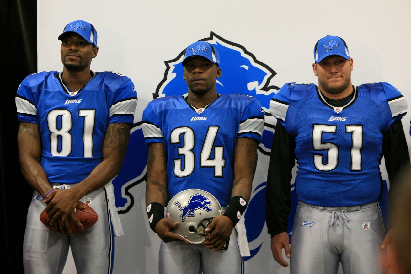
It’s a new day in Detroit. The Lions are seemingly on the verge of becoming one of the best teams in the NFL. Along with that, the excitement around the Detroit Lions from fans and media pundits is at an all-time high. There’s only one problem. The Lions are still wearing the uniforms they wore during arguably the worst time in the franchise’s history.
There have been discussions about new uniforms since general manager Brad Holmes and coach Dan Campbell showed up in Detroit. They’ve gotten louder as the years have gone by. Well, here’s some good news. Those new uniforms might be on their way very soon.
Amon-Ra St. Brown was on YouTube’s Tuesday Night Gaming this past week and may have leaked a little info about the Lions uniform intentions, saying that they’re ‘coming soon.’
Last year, team president Rod Wood said he put together a committee to get the process started on evaluating their uniform options. In other words, St. Brown’s off-hand statement likely has truth behind it.
So now we need to talk about what these jerseys should look like. Here are some of my ideas, as well as my favorite designs from around the internet.
My idea
The 90s, much like Hansel, are so hot right now. Take a look around sports. The Pistons brought the teal back, the Buccaneers have that orange cream jersey, the Giants are rocking their 90s look, and so many others are also bringing a retro look back. Even teenagers today are pretty much wearing everything millennials wore in the 90’ when they were teenagers. Pretty soon kids are going to be playing with their Tamagotchis and gleefully thanking their mom for buying Sunny D while wearing their new pair of JNCO jeans. Oh my god! I just looked up Tamagotchis and they’re selling them again. Give me back my life, you youthful bastards!
Sorry I got a little carried away there. The point I’m trying to make is that the Lions need to get in on this action. I don’t know if they should design their entire new scheme around that idea, but they should definitely bring the look back as an alternate. Since you’re able to now have multiple helmet designs, the Lions should pair those throwbacks with helmets that feature their old log on them. Hopefully along with that, we can buy some new gear that features that old logo. Yes, I partially want this to happen so I can expand my wardrobe.
I know I gained a little bit of heat last week when I put out my guide to the perfect offseason and suggested that the Lions bring back a black alternate, but I’m sticking with that. The black really makes that Honolulu blue pop off the jersey.
If that’s not an option, then the Lions should think about doing something totally different. I’m talking about adding a color that isn’t usually an option for this team. What about something with gold? What about going back to their Portsmouth Spartans roots with this look.
IMO, the Detroit Lions should wear Portsmouth Spartans throwback uniforms on Thanksgiving at some point. Maybe the team’s 100th anniversary season (2030 for the franchise founding in Ohio, or 2034 for the relocation to Detroit). pic.twitter.com/BYkF1zLW8Y
— Bill Shea (@Bill_Shea19) November 24, 2022
Maybe they shouldn’t. Whatever they do, I just hope it doesn’t suck.
Ideas from the internet
I took a visual communications class in high school and I learned how to use Photoshop. I thought I was pretty good at it. Now that every third person on the internet is a fully functioning graphic artist, I realize that I chose the right vocation for me. It damn sure wasn’t making art.
Anyways, I’ve been scouring the internet and I have seen a ton of cool designs that the Lions could base their new look on. Here’s my favorites that I found.
(If you don’t see the image above, click here.)
First is this option from The Graphic God. The Lions have been using an all-white look for the past two seasons, but this look is pretty clean. Obviously this is just a jumping off point. There’s still a need to update the numbers and design of the whole thing, but the idea is there. An all-white icy look with silver numbers is something I can get behind as an alternate.
(If you don’t see the image above, click here.)
This look from Dubya Design is one that I really like. It’s an updated combination of old and new together and it really pops. I love the numbers. They’re easily readable from any level at the stadium and the slight color change to a more powdery blue is welcomed. This is something that the Lions can use as their normal home jersey. It’s kind of a timeless look. In dig it.
/cdn.vox-cdn.com/uploads/chorus_asset/file/24394848/578cac86114063.5d8fe47cecb0f.jpg)
Here’s a interesting idea from Tucker Standlee. There’s a bit of an old school look here. You can see there’s some 90s inspiration. The biggest thing here is obviously a new logo. While I think it’s cool, the Lions need to stay put with their current logo. The Lions logo has gone through many changes in since joining the NFL, but the idea of a leaping lion as remained the same. The Lions shouldn’t stray from that. They can update it again, but keep the idea the same. Actually, just don’t change it at all.


You must be logged in to post a comment Login